Media kit introduction.
You'll also find how we expect the visual identity to be applied. These examples and principles are meant as guidance and inspiration. Tools that help you build a strong and consistent brand. Use them to make confident, on-brand choices.
Logos
When possible please use the full color version with black wordmark on light backgrounds.
To protect the integrity of the Centric logo,
it's important to use it consistently and
correctly. The examples on this page
highlight common misuse and incorrect
applications. Avoid these treatments to
ensure the logo remains recognizable,
legible, and aligned with our visual identity.

The Swirl
Progress is a continuous cycle. An ongoing process
that keeps evolving and building upon itself. The swirl
captures this idea. It is a flexible brand element that
brings movement and energy to the identity.
It adds depth, movement and a dynamic expression,
whether used in animation or as a static element.

Images
Centric is about people, so we use human and authentic photography. Real snapshots from daily life.
We capture natural moments and movement, avoiding posed or staged situations.
Centric plays a role in the lives of citizens, colleagues, and professionals.
Our photography reflects that everyday reality.
Typography
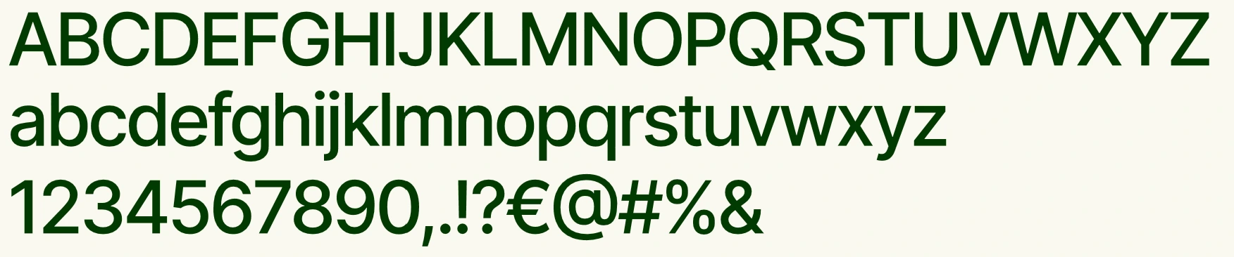
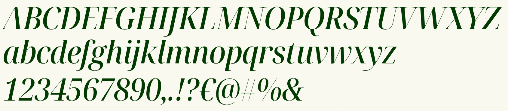
Inter and Noto Serif Display are
the primary typefaces of the
Centric visual identity.
Inter is a versatile and contemporary sans
serif that works for both large titles and small
body text. Its clean and timeless character
ensures readability and consistency across
all applications.
Noto Serif Display in the style Semi
Condensed - Medium Italic is used to
highlight key words in titles or to add a
refined accent to supporting copy.
Download links can be found on the right.